Cera Stribley [2023]
<Project Overview>
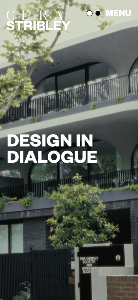
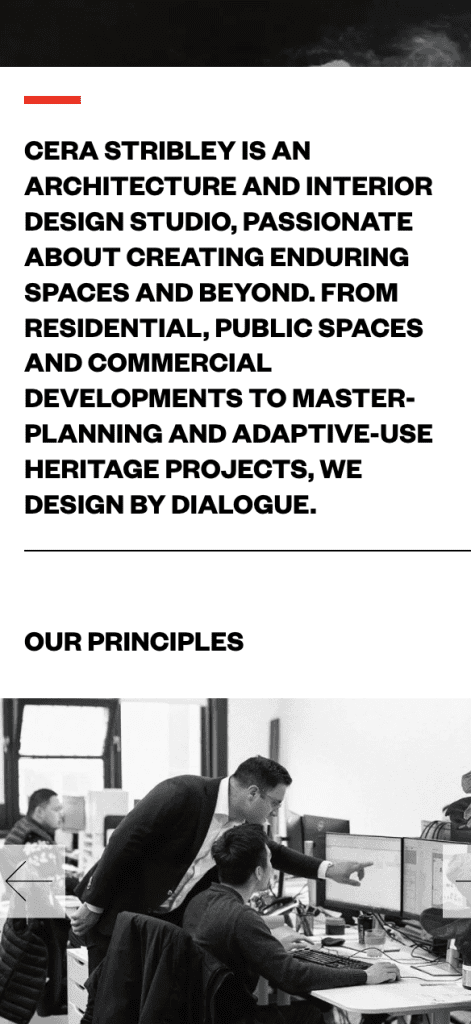
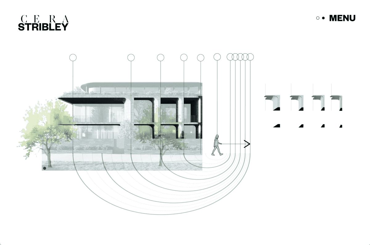
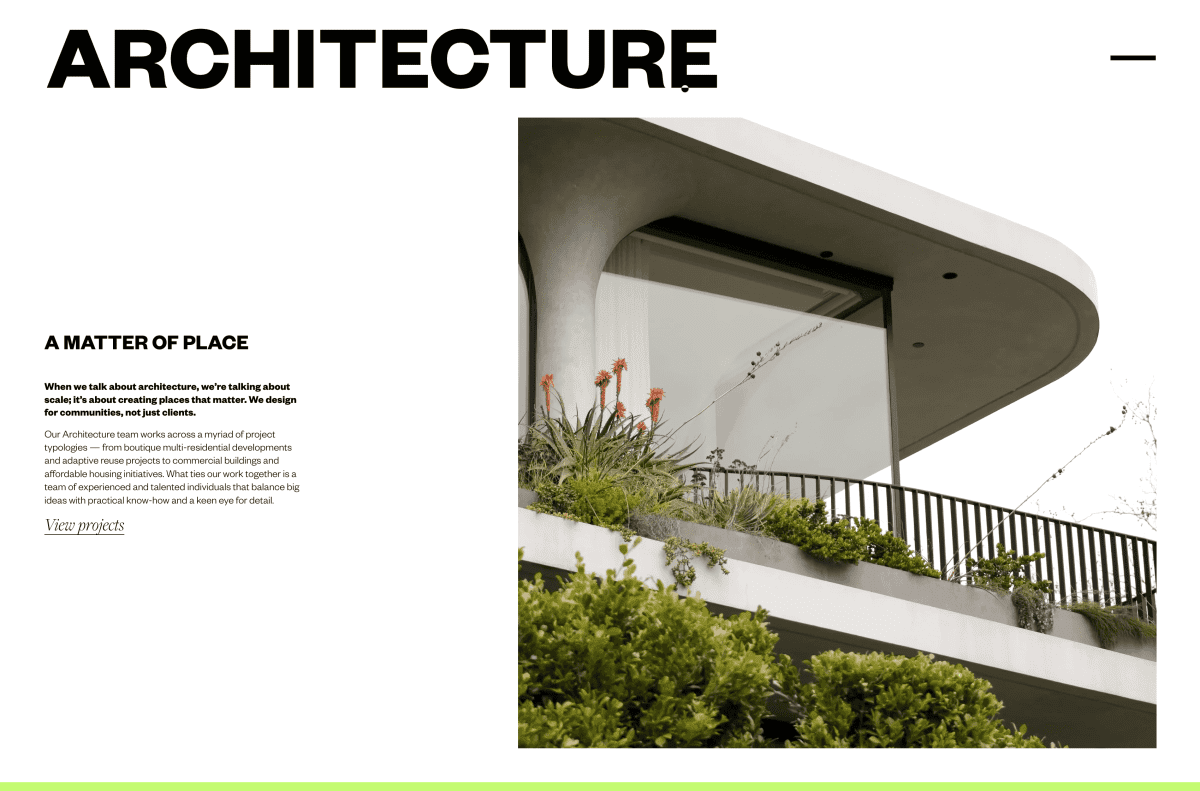
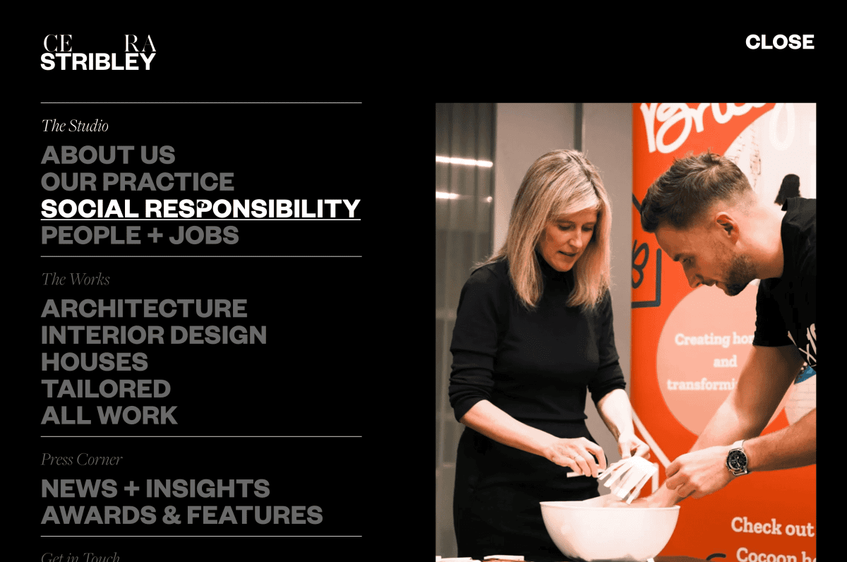
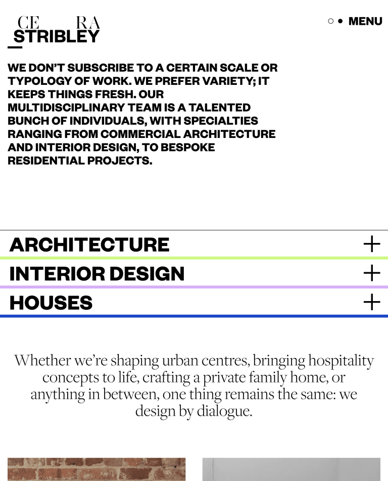
It’s nice when you go back and visit a site you built a while back and you’re still impressed. The use of elegant video clips, the intricate interactive map and use of subtle use animated text to highlight their Design in Dialogue philosophy, all come together to create something special.
<Sector>
<Scope>
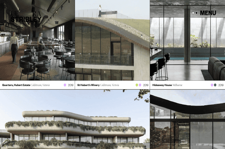
- Interactive Project Map
- Text Animations
- Intranet
- Video
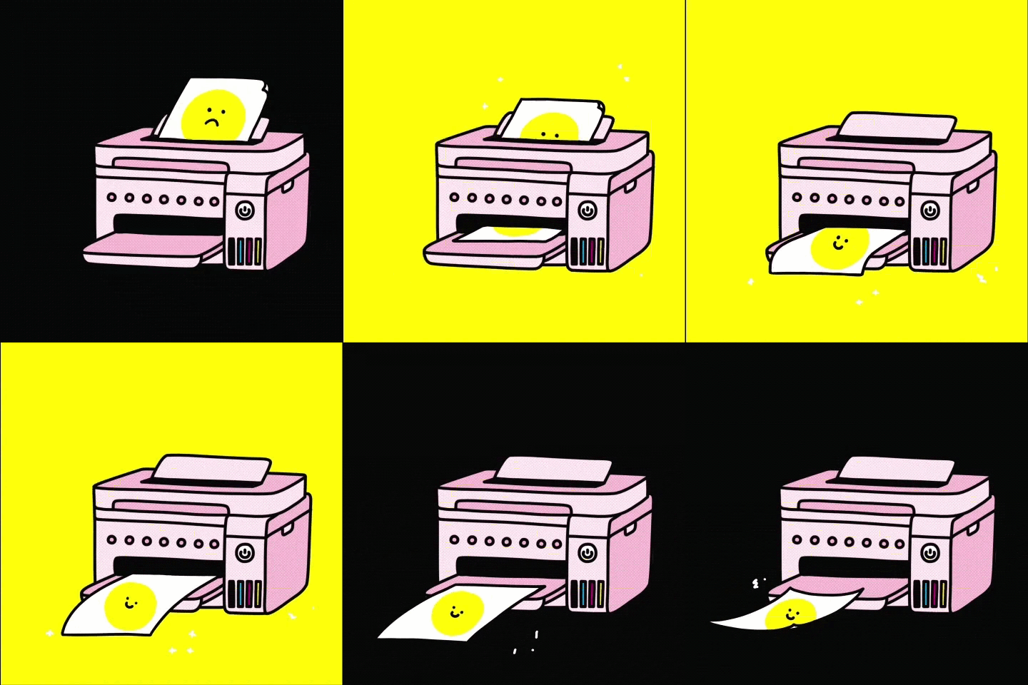
- Animated logo
The team at Studio White Noise created a beautiful design that really does reflect the Cera Stribley brand. Moving through the site, you can’t help but appreciate the attention to detail that has gone into the content and the way it’s been woven together to create a seamless and engaging experience.


Creative collaboration
The level of detail in the project highlights is genuinely impressive. The interactive elements that reveal the design progression offer real insight into the thoughtful consideration that shapes the team’s work.
